
A guide to choosing a layout
Which form layout fits your task?
The same questions can feel quite different depending on how they’re laid out. One page shows everything at once. One question at a time gives each question the whole screen. Neither is better in general. The right one depends on the form and the people answering it.

The same form, two ways
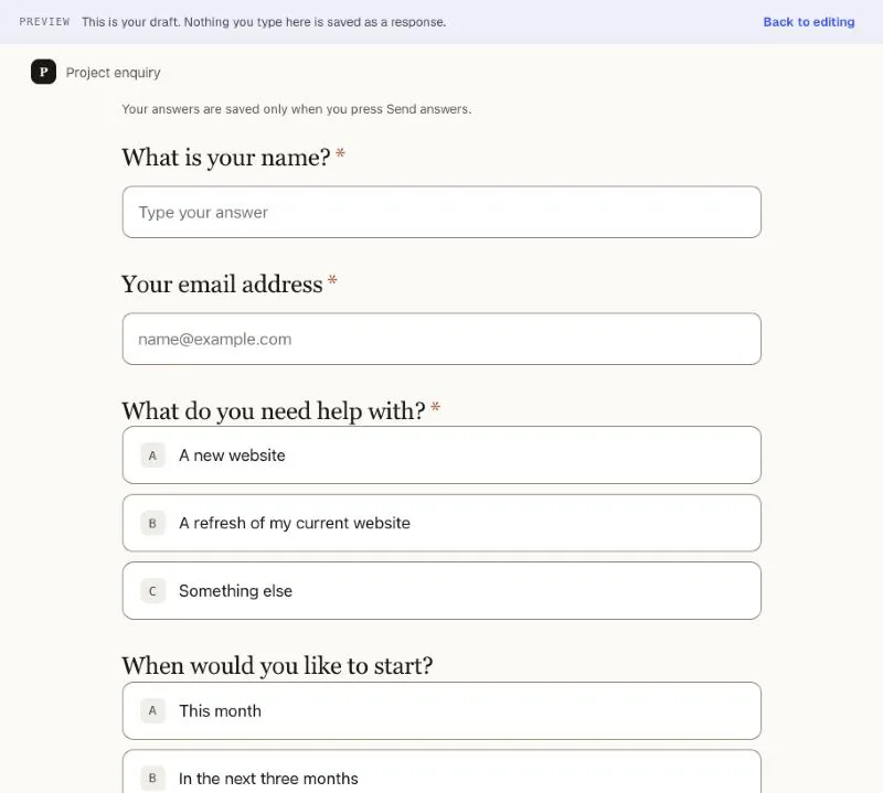
Here is one short enquiry form shown in both layouts. The questions are identical. In Formaverse you switch between them with the One page and One per question buttons at the top of the editor.
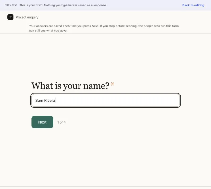
One question at a time
The same form, one question per screen. A counter shows how far through the form someone is. Questions hidden by a rule are left out of the count, so this form shows four steps, not five, until the follow-up applies.
How they compare
These are differences you can see in the product, not promises about completion rates. Your own forms and the people answering them will decide which works better.
| Aspect | One page | One question at a time |
|---|---|---|
| Overview | People can see the whole form before they start. | People see one question, and a counter shows how far they have to go. |
| Focus | Everything is in view, which suits quick, familiar forms. | One thing to think about at a time, which suits harder or more personal questions. |
| Going back | Scroll up to change an earlier answer. | Press Back to return to an earlier question. |
| On a phone | A long scroll on a small screen. | A short screen with one question and a button. |
| Longer explanations | Long descriptions add to an already long page. | A description shares the screen only with its own question. |
| Saving | Without page breaks, answers are saved only when someone presses Send answers. With page breaks, each part is saved when they press Next. | Answers are saved each time someone presses Next, so you can see partial answers. |
One page on a phone
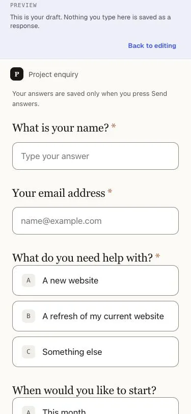
Most differences are easiest to see on a small screen. One page becomes a long scroll.
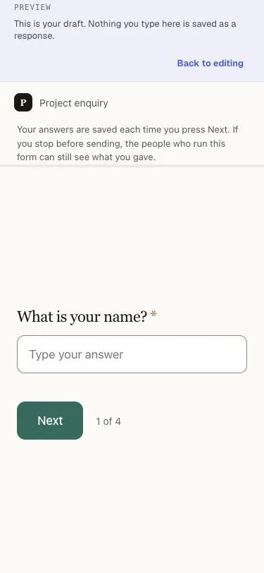
One question at a time on a phone
One question at a time stays short, with the button always close by.
Grouping and logic
On a one page form, a page break splits the form into parts, like “About you” and “About the day”, and each part gets its own screen. One question at a time already gives every question its own screen.
Rules work in both layouts. On one page, a follow-up appears in place as soon as it applies. One question at a time, it becomes another step.
Choosing by task
| Form | Try first | Why |
|---|---|---|
| A quick contact or RSVP form | One page | Three or four questions are easy to take in at once. |
| A client intake or job application | One question at a time | Longer and more personal, so one question at a time feels lighter. |
| Event registration with several parts | One page with page breaks | Parts like “About you” and “About the day” give natural pauses. |
| Feedback after a session | Either | Keep it short, and both work well. |
Test the layout you choose
Before you share the form, try it the way your respondents will.
- Open the preview on a phone as well as a computer.
- Fill it in using only the keyboard: move between questions, choose an answer and send it.
- Choose answers that trigger each rule, and check the follow-ups appear where you expect.
- Ask one or two people who will really fill it in to try it, and watch where they hesitate.
Next step
Try both layoutsKeep reading

Layouts
Same questions. Your kind of rhythm.

Event registration
Bring the right people together, with the details sorted.

Conditional logic
Show the right next question, and skip the rest.
That idea in your head?
Give it a form.
You bring the curiosity. We’ll bring the checkboxes.
Make something, freeFree to start. Yours to make.